Flamer: Raw Industrial Power in UI Design
Révolté
Editor-in-Chief
We have reached peak polish. Everything is rounded, softened, and safe. Flamer is the antithesis—a return to the raw, the jagged, and the powerful.
The Brutalist Resurgence
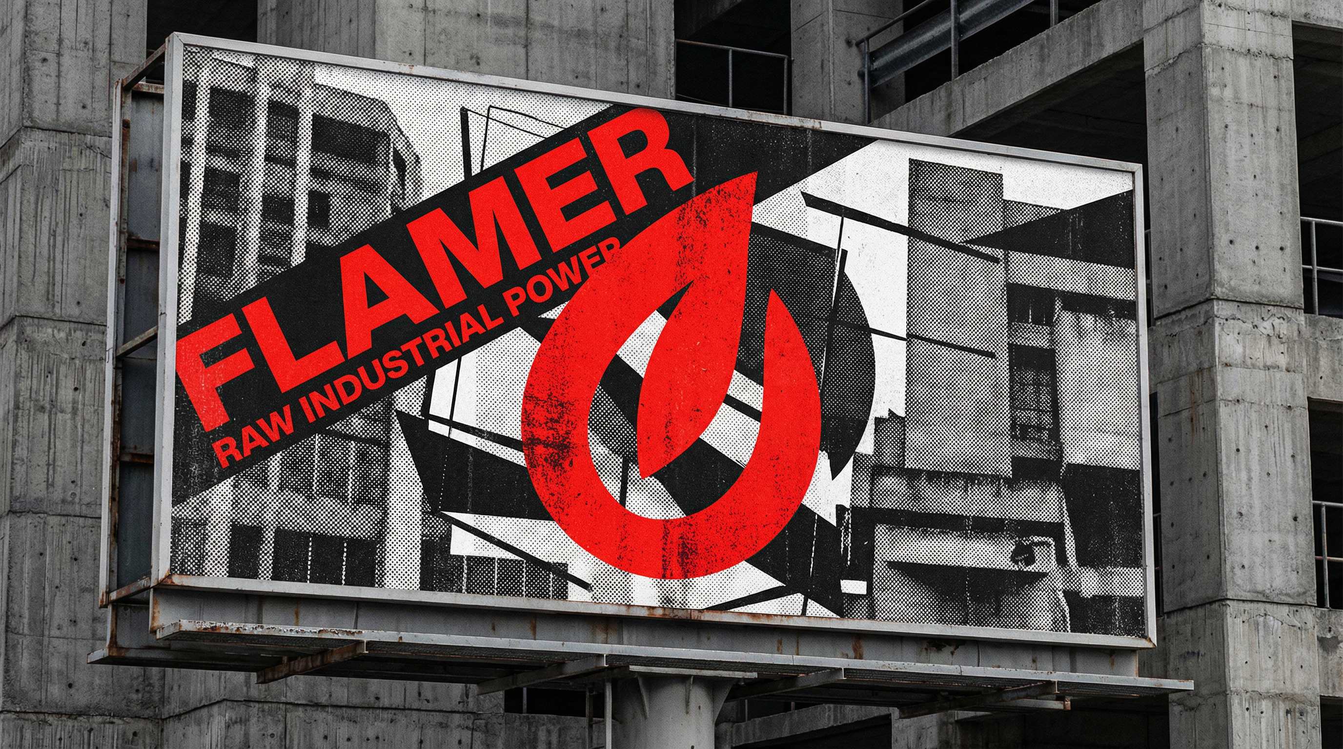
Digital brutalism isn't about being ugly; it's about honesty. It exposes the structure rather than hiding it. It uses default fonts, high-contrast colors, and rigid grids not because they are "easy," but because they are true.
Industrial Semiotics
In the Flamer project, we leveraged visual language from heavy industry—warning stripes, stencil typography, and high-grain textures. This communicates reliability and power in a way that "friendly" corporate Memphis art never could.
When your tool is powerful, your interface should feel like a cockpit, not a toy.