How Minimalist Design Builds Brand Authority
Révolté
Brand Strategist & Designer
In an era of visual overload, minimalist design isn't just an aesthetic choice—it's a strategic power move. When we designed The Archive, a fashion and lifestyle brand, we proved that removing elements can actually amplify your brand's authority.
The Psychology of Visual Restraint
Every element on your website is competing for attention. When you overwhelm visitors with options, animations, and visual noise, you're essentially shouting at them. Authority doesn't shout—it speaks clearly and expects to be heard.
Minimalist design leverages what psychologists call "processing fluency"—the ease with which our brains process information. When a design is clean and uncluttered, users can focus on your message rather than decode your interface. This cognitive ease translates to trust, and trust is the foundation of authority.
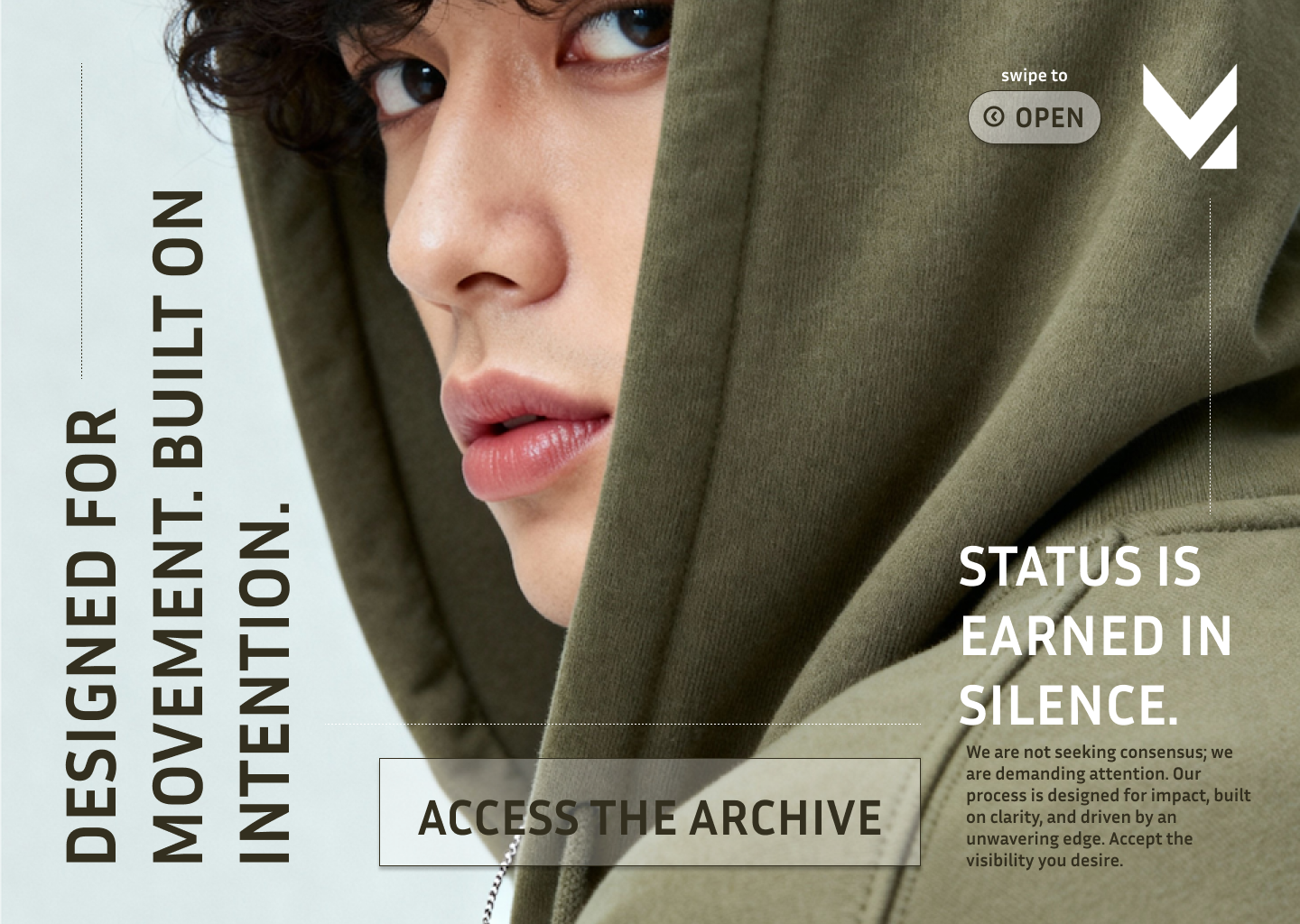
The Archive Case Study: Less is Authority
The Archive came to us with a challenge: they wanted to position themselves as a premium lifestyle brand for conscious consumers. Their previous website was busy—competing CTAs, multiple font families, and a color palette that tried to please everyone.
We stripped everything back. Monochromatic color scheme. Single primary typeface with strategic weight variations. Generous white space that lets products breathe. The result? A 47% increase in average session duration and a 32% boost in conversion rate within the first month.
Key Principles for Authoritative Minimalism
1. Strategic Typography
Your typeface selection signals your brand personality. We chose a geometric sans-serif for The Archive—clean, modern, and unapologetically confident. Pair one display font with one text font maximum. Any more dilutes your visual voice.
2. Ruthless Content Editing
Every word must earn its place. We reduced The Archive's homepage copy by 60% while actually communicating more effectively. The secret? We focused on benefits and emotional resonance rather than feature lists and corporate speak.
3. Intentional Negative Space
White space isn't empty—it's breathing room for your most important elements. We designed The Archive with 40% more negative space than their previous site. This wasn't wasteful; it was strategic emphasis. The eye naturally gravitates to elements surrounded by space.
4. Monochromatic or Limited Palettes
Color psychology matters, but restraint matters more. The Archive uses primarily black, white, and shades of gray with a single accent color used sparingly. This creates visual cohesion and makes intentional color moments incredibly powerful.
Common Minimalism Mistakes to Avoid
Minimalism ≠ Boring. Many brands confuse minimalism with removing personality. Your brand should still be distinctive and memorable—you're just communicating it more efficiently.
Don't sacrifice usability. Minimalism should never make your site harder to use. Every reduction should serve the user's journey. If removing navigation elements confuses users, you've gone too far.
Context matters. Minimalism works brilliantly for premium brands, professional services, and thoughtful products. It's less effective for entertainment, children's products, or brands where energy and playfulness are core values.
Implementing Minimalism in Your Brand
Start with an audit. List every element on your homepage. For each one, ask: "Does this directly serve our primary user goal?" If the answer is no or even maybe, remove it. You can always add back what's truly necessary.
Focus on hierarchy. With fewer elements competing for attention, your visual hierarchy becomes critical. Use size, weight, and position deliberately to guide the user's eye through your desired narrative.
Test aggressively. Minimalism should improve user experience metrics—if it doesn't, you're doing it wrong. Monitor bounce rates, session duration, and conversion metrics closely as you simplify.
The Business Case for Minimalism
Beyond aesthetics, minimalist design offers tangible business benefits. Faster load times improve SEO and user experience. Fewer elements mean lower maintenance costs and easier updates. Clear messaging increases conversion rates. Distinctive visual identity strengthens brand recall.
For The Archive, minimalism wasn't just a design choice—it was a business strategy that aligned perfectly with their brand values of intentionality and quality. Their clean digital presence now reinforces their product philosophy at every touchpoint.
Final Thoughts
Authority comes from confidence, and confidence doesn't need to explain itself. When your design speaks clearly and purposefully, users perceive your brand as more established, trustworthy, and premium—regardless of your actual company size.
Minimalism isn't about doing less work; it's about doing more thoughtful work. Every element that remains must be exceptional. Every word must carry weight. Every pixel must serve purpose.
In a world that's constantly demanding more, brands that master the art of less will rise above the noise and establish the kind of authority that can't be bought—only earned through clarity, intention, and restraint.
Need help establishing brand authority through strategic design?